Coke’s New Typeface Is a Branding Dumpster Fire—And the Outrage Is 100% Justified
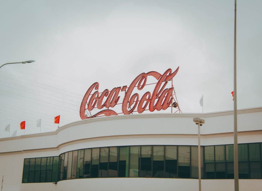
Let’s talk about the real reason everyone’s torching Coca-Cola for their so-called ‘Marlboro’ typeface: it’s not nostalgia, it’s brand vandalism disguised as innovation. Nobody’s buying the design agency’s deck full of kerning babble and faux-heritage babushka doll slides. If you saw the Coke cans at Astor Place this Monday, you’d swear they were bootlegs from a discount bodega in Flatbush—flat, aggressive, and about as warm as a glass of day-old seltzer.
This isn’t a minor tweak or some ‘fresh new look’ tailored for TikTok-addled Gen Z. It’s a full-on sacrifice of everything that made Coke’s visual DNA iconic. The new font looks like it was yanked from a 1997 cigarette ad, hence the ‘Marlboro’ nickname burning up group chats. If you’re wondering why people are pissed: it’s because Coke’s old script was the visual equivalent of a summer boardwalk—familiar, inviting, and totally theirs. Now it feels like a brand that’s lost the plot.
The agencies peddling this say consumers are ‘possessive’ and ‘resistant to change’. Translation: ‘We didn’t bother to test this with anyone who actually buys Coke, but our creative director’s cousin loved it on Instagram.’ This is peak cargo cult branding—change for the sake of making a quarterly pitch deck sparkle, not because it serves the product or the people drinking it.
Let’s be clear: the fury isn’t irrational. Coke belongs to the people in a way most brands never will. You mess with that at your peril, especially in summer, when half the city is clutching a cold can on the F train or at a stoop party. That’s real equity, and you can’t rebrand your way into or out of it without consequences.
Uncomfortable truth? If you’re a brand manager reading this, kill your ‘refresh’ until you’ve tested it in the wild—on a sweaty Saturday in Queens, not in some post-hipster Williamsburg focus group. And if your agency’s main pitch is ‘let’s be bold,’ fire them. Bold isn’t what loyal customers want. They want to know you’re not going to sell them out for a line of Helvetica knockoffs.
Frequently Asked Questions
Why is Coca-Cola’s new typeface called ‘Marlboro’?
The new typeface is nicknamed ‘Marlboro’ because it resembles fonts used in 1990s cigarette ads.
What is the main criticism of Coca-Cola’s new branding?
The main criticism is that the new typeface alienates loyal customers and undermines Coke’s iconic visual identity.
Was Coca-Cola’s new typeface tested with actual consumers?
According to the article, the rebrand was not tested with real consumers and was only praised by insiders.
How do people describe the new Coke cans’ appearance?
People describe the new cans as flat, aggressive, and resembling bootlegs from a discount bodega.
Why are people upset about Coca-Cola’s rebranding?
People are upset because the new design sacrifices the familiar, inviting script that made Coke’s branding iconic, making the brand feel lost and disconnected from its customers.