Coke’s Typeface Faceplant: Why Brand Nostalgia Isn’t an Excuse for Design Laziness
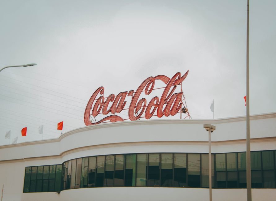
It’s Saturday in New York, and the only thing hotter than the pavement is the collective indignation over Coca-Cola’s new ‘Marlboro’ typeface. You’d think someone had swapped the Empire State Building’s spire for a vape pen. Instead, all Coke did was tweak their logo—and half the internet’s ‘brand guardians’ lost their minds. The outrage isn’t about kerning, it’s about identity theft. People don’t just drink Coke; they wear it, Instagram it, tattoo it on their biceps. So when the brand’s new typeface rolled out looking like it was lifted off a pack of cigarettes from 1986, the backlash was instant and vicious.
If you missed it—lucky you—the new font is a weird, blocky, slightly menacing slab that screams ‘cowboy cancer stick’ instead of ‘American refreshment.’ You can’t unsee the Marlboro parallel. But here’s what nobody at the $3,000-a-day design agencies wants to admit: this is the logical endpoint of a decade of branding-by-committee. You get a typeface that’s less ‘timeless classic’ and more ‘focus group Frankenstein.’ When you worship at the altar of disruption, you lose the plot, and forget that Coke’s red script is more sacred to people than their high school yearbook photo.
Let’s not pretend this is about user experience or legibility either. This is about lazy, self-referential design culture chasing headlines instead of resonance. You want to know why people are mad? Because this rebrand is a monument to the kind of creative cowardice that’s been festering in Soho studios since the last heatwave. If you want to see what real design leadership looks like, go to any Brooklyn bodega and look at the hand-painted ‘OPEN’ sign. It’s not perfect, but it’s honest.
And the best part? Coke’s defenders trot out the same tired lines: ‘Brands have to evolve!’ ‘Change is hard!’ Save it. People are mad because we’re stuck in a cycle where brands pretend to be “brave” but are just recycling old visual tropes under a new coat of paint. The world doesn’t need another retro-nostalgia remix. It needs brands with the guts to actually listen to their customers and stop hiding behind design jargon.
Here’s a concrete, uncomfortable recommendation: next time you’re about to drop seven figures on a rebrand, take your design team to the Bronx on a Saturday afternoon. Ask real people what Coke means to them. Spoiler: they won’t say ‘Marlboro’.
Frequently Asked Questions
Why is Coca-Cola’s new typeface being criticized?
Coca-Cola’s new typeface is being criticized for resembling Marlboro cigarette branding from 1986 and for reflecting lazy, committee-driven design rather than genuine brand evolution.
How much do design agencies reportedly charge for rebranding like Coca-Cola’s?
The article claims design agencies charge $3,000 a day for such rebrands.
What is the main complaint about Coca-Cola’s rebrand according to the article?
The main complaint is that the rebrand is a product of branding-by-committee and retro-nostalgia trends, resulting in a typeface that lacks authenticity and resonance with real customers.
How has the public reacted to Coca-Cola’s new typeface?
The backlash has been especially strong in New York, with people describing the new font as looking like it was taken from a pack of cigarettes rather than representing American refreshment.
What does the article suggest Coca-Cola should do before rebranding?
The article suggests that Coca-Cola should take their design team to the Bronx to ask real people what Coke means to them before spending large sums on a rebrand.